
Can you spot the hidden meaning in these 5 famous logos?
Logos and brands adorn our world. They are instantly recognisable and confer subliminal messages because they are designed using great creative ingenuity underpinned by research and thought.
A survey of 7,000 people across six countries, including the UK, found that more people can identify the golden arches of McDonald’s than the Christian cross!
When a brand becomes so central to a person’s thoughts and life experiences, the hidden message can be very powerful.
Here are five of my favourite:
- McDonald’s
According to the BBC, McDonald’s wanted to change their logo in the 1960’s but their top design consultant told them not to. According to him, the golden arches symbolised ‘a pair of nourishing breasts.’ Whether it’s true or not, their logo is one of the most recognisable in the world.
- FedEx

In design, we say ‘less is more’ but it’s what you do with the ‘less’ that matters. The FedEx logo is the most creatively simple. The arrow between the E and X represents the forward thinking and outward looking vision of the company.
- Amazon

At first glance, the yellow arrow looks like a smiley face to represent the company as a friendly entity but if you look closely, the arrow begins at ‘A’ and finishes at ‘Z’ to illustrate the idea that you can practically find anything you need from the company.
- Pepsi
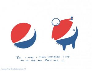
It took the design agency five months to complete the Pepsi logo and it was a costly one too (costing over 1 million dollars). It is said that the logo was inspired by the Da Vinci Code, Feng Shui and the Earth’s Geodynamo. However, if you add arms, legs and a head onto it, it looks like an overweight person with his gut hanging out! However, I am sure that was not the intended purpose behind the logo!
- Apple
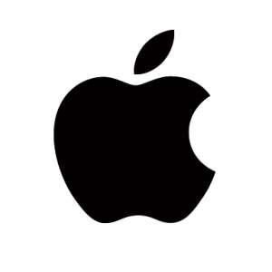
The mainstream media has made the Apple logo into a tale about the forbidden fruit from the “Tree of Knowledge” as per the Biblical story of Adam and Eve. The Apple designer, Rob Janoff, said this was not intentional because he put the bite in there to stop it being confused for a cherry!