
All big organisations and businesses carefully select the colours for their logo and branding they use.
Here’s why:
YELLOW= Hunger!
Yellow is the colour most commonly associated with hunger which is why the largest fast-food chains McDonalds and Subway both use it boldly.

![]()
Yellow is also the colour that catches the eye faster than any other colour; it is always seen in signs and building work. JCB is also a good example.
RED = Increases the heart rate!
This is a very powerful colour and is scientifically proven to increase your heart rate and blood pressure. It also portrays passion hence why the colour dominates Coca-Cola, Vodafone and Richard Branson’s Virgin Enterprise.


![]()
ORANGE = Fun and playful
There is one company that has owned this colour by quite literally naming themselves ‘Orange’, even though it has now merged with T-Mobile to form EE mobile. If you Google ‘Orange’, their logo comes up as the third highest ranked image! We also have EasyJet, everyone’s favourite budget airline.


BLUE = Clean and cool
This colour signifies dependency and trustworthiness. This is why the world’s largest employer the NHS and Barclays uses this colour wholeheartedly.


Blue is also Mark Zuckerberg’s favourite colour since he is colour blind. Blue is the richest colour he can see and why he decided on the Facebook logo being blue. It is also reported that his house is also painted in different shades of blue.

PURPLE = Loyalty
This colour makes people nostalgic by bringing back memories and allows people to reminisce and become sentimental. Cadbury’s Dairy Milk takes this to such a degree that they have claimed the right to a specific purple colour tone, Pantone 2658c – which is officially Cadbury purple. Nestlè tried to challenge this copyright but failed and now Cadbury has the right to the colour exclusively for its chocolate and drinks packaging.

GREEN = Emotionally positive
It signifies nature, rebirth and growth. It is used to show abundance and darker green seeks to represent luxury and wealth. It can exude class, sophistication and prestige, which is why the famous Harrods loves the colour.

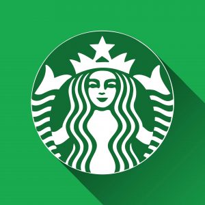
However, the most famous brand that tried to take ownership of the colour is no other than Starbucks. Their logo was originally brown to signify coffee beans, but they decided to move to green to get away from brown’s association with dirt and soil.
WHITE = Every colour’s best friend
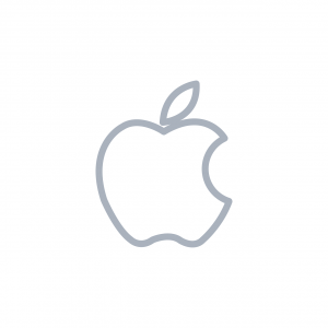
It is a neutral colour and hence associated with innocence, purity and spirituality. It is also the ruling colour for cleanliness and why it dominates beauty products. Apple has mastered the use of white in all its products and is the market leader in using white as it connects well with its design ethos: simplicity is perfection.
Feel free to share your thoughts and leave a message below.