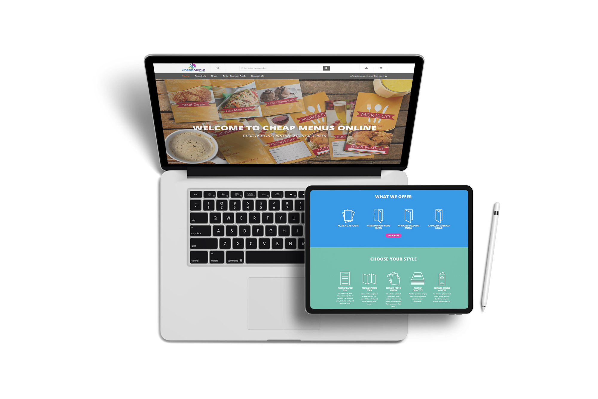
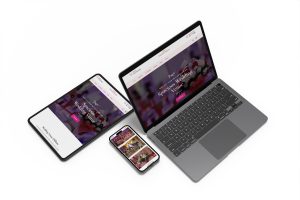
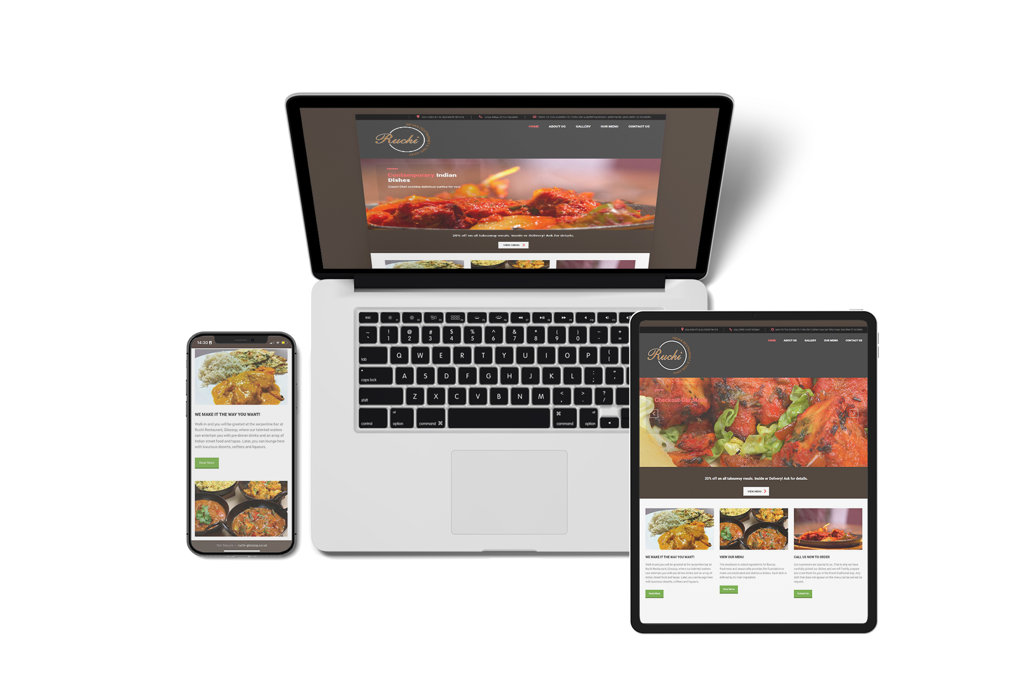
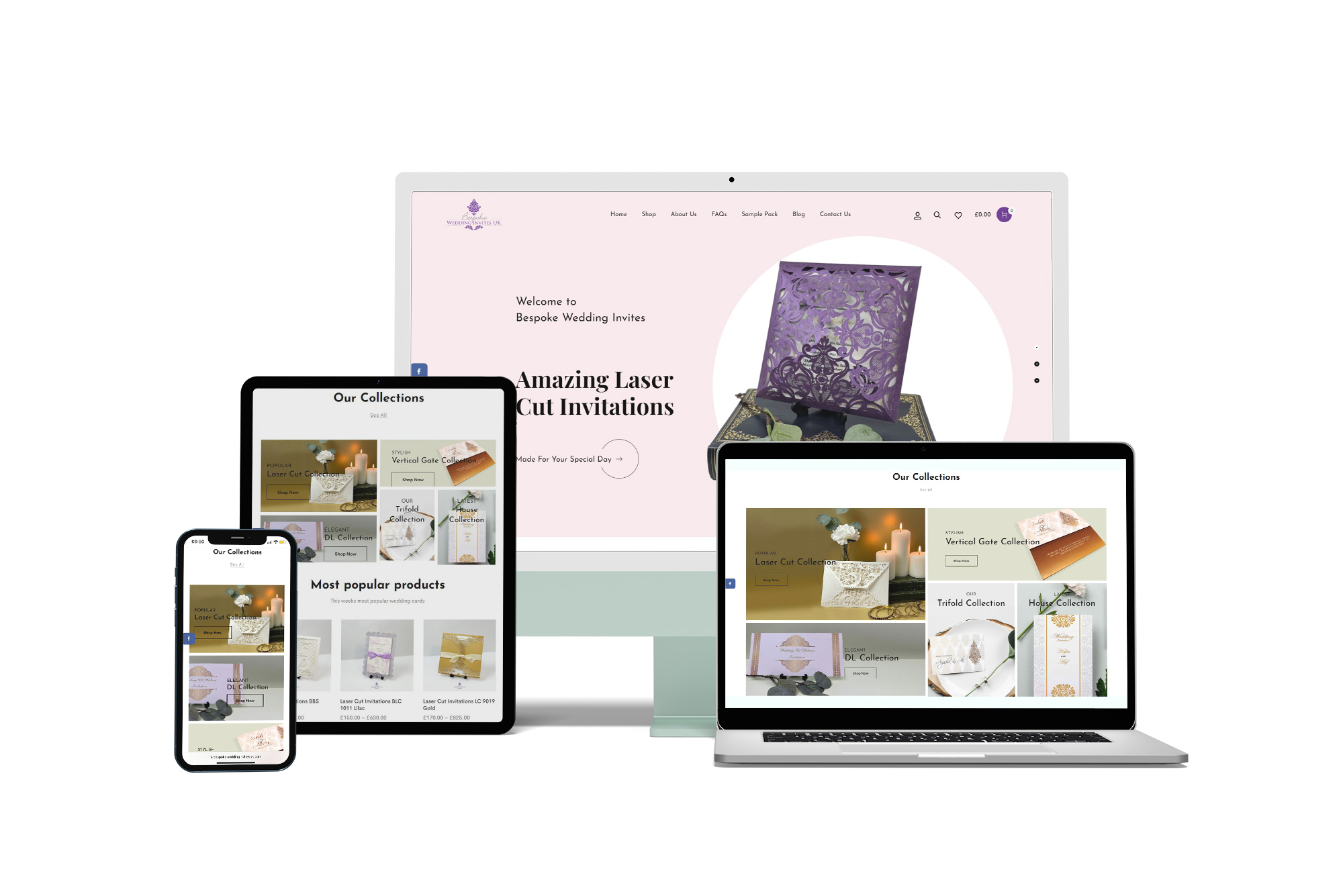
Responsive Web Design (RWD)
In simple terms, this is about how your website looks regardless of what device you may be using. It doesn’t matter if it’s a 40 inch cinema display or a 4 inch smart phone, the code and design of the site should adapt to give you the optimal viewing experience.
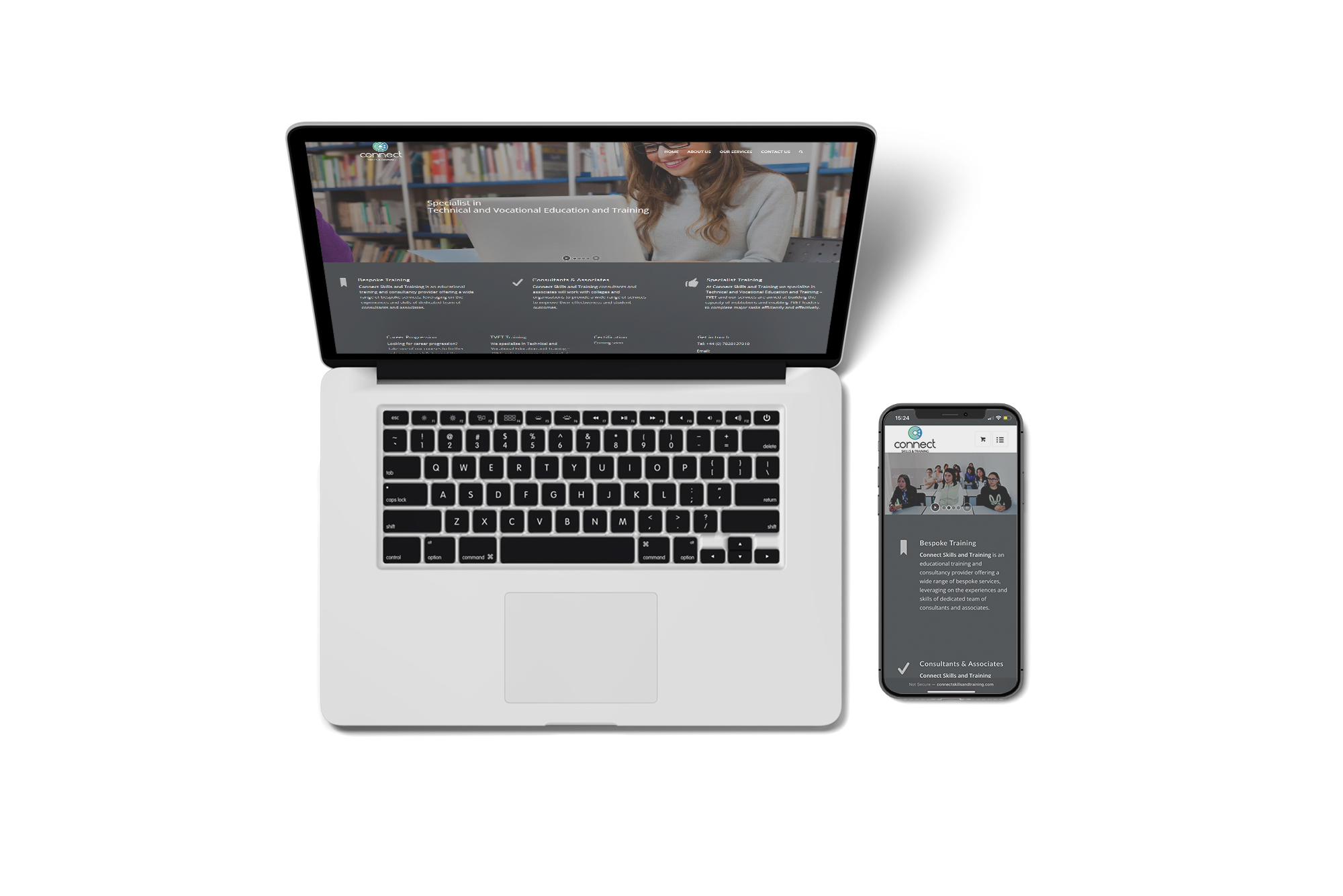
Here is what a responsive website would look like compared to a static website:
Reason 1: 70% of people shop online
According to Ofcom (Media regulatory umbrella body), over two thirds of people in the UK spend roughly two hours a day shopping online, mobile banking and checking their social media profiles. With 98% of the UK now able to access 4G, this surge is only going to increase. A responsive website is the only way to future proof your presence online and ensure that you are able to take advantage of the growing online business market.
Reason 2: The three second rule
According to Google, people are prepared to wait only 3 seconds for a website to load before they move on. If your website is static it is likely to take a long time to load on a smartphone or tablet and your customer is likely to then move to your competitor’s site.
The sign of a good website is if the user can find what they’re looking for with no more than three clicks.
Reason 3: Majority shop using mobile devices
As you can see from the Ofcom data graph below, 52% of all usage on the internet is via smartphone or tablet. This is data from 2014 and considering it was on an exponential curve three years, it’s likely to be significantly higher now. This makes it even more essential for your website to be mobile responsive.
Reason 4: Google will love your website
In 2016 Google changed its algorithm to favour mobile friendly websites and decided to penalise sites that are static by ranking them lower on the search engine. Thus by having a responsive website, you organically get the best of SEO (Search Engine Optimisation).
Do not take a shortcut and design and build a website using WIX, because Google is not a fan. It performs poorly on search results and because WIX uses a form of Flash technology, your website will not rank well. WordPress template is the most favourable.
Reason 5: Lower the bounce rate